
Pablo
Picaso is a wonderful artist to study due to the story of how he became
an artist and how he developed and changed art forever. I love to tell
the students stories about how we enjoy abstract art now, but that there
was a time when this type of art was misunderstood. Pablo Picasso had
to create thousands of works of art to prove that his work was worth it
and not just goofy child-like drawings. Artists like Pablo Picasso paved
the way for contemporary and modern artists who created work from the
early 1900's to today.
In
this lesson I first spent roughly 10 minutes discussing the Picasso
story and the significance of his work. I focused on Picasso's use of
color and how the human figure was created using abstract methods rather
than realistic.
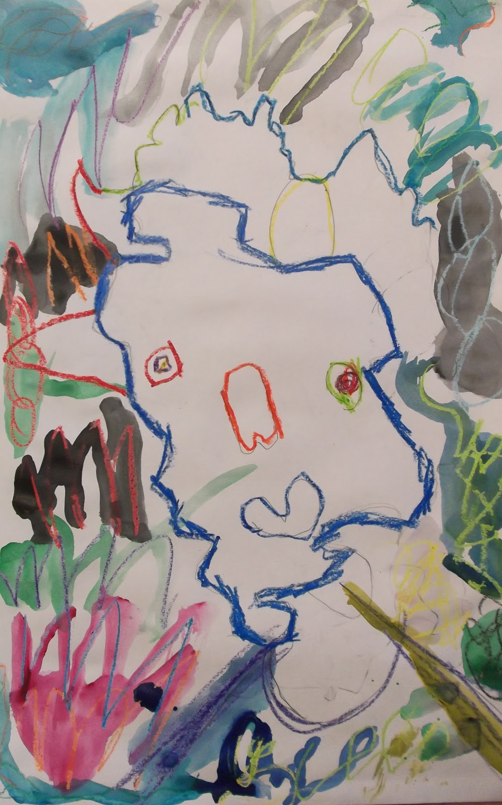
I
compared the oval shape of a human head to the organic style of Pablo
Picasso and instructed the students to create the form of the head using
their entire arm movement, rather than locking their hand into the
paper and forcing them to draw a smaller form. Once a head form is
drawn, the students place the various parts of the
face in unsuspecting different places around the original form.
You can see how the students really experimented with using their expressive abilities to create abstract compositions.
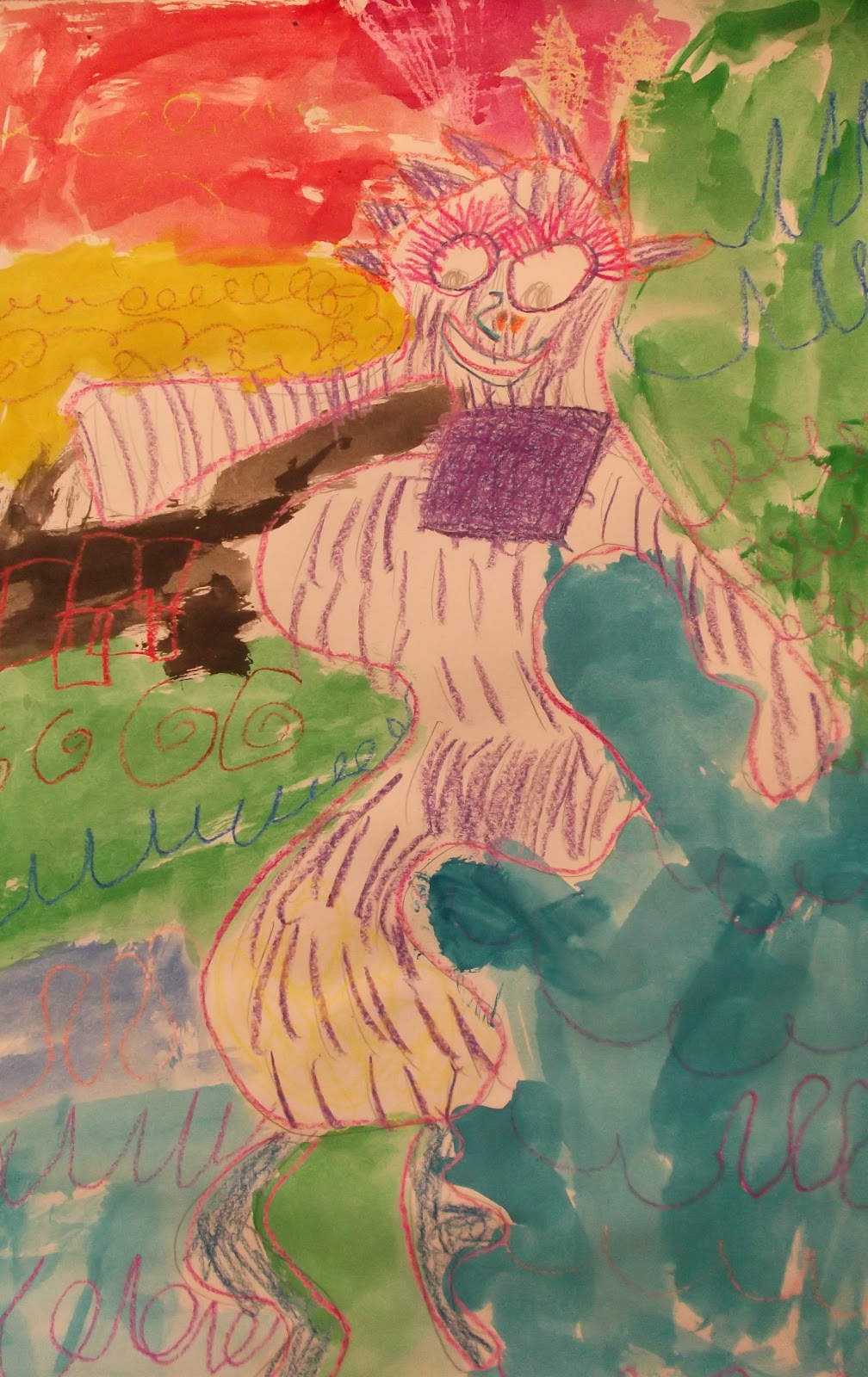
Now
that the sketch work was done, it was time to introduce theories behind
color usage and the crayon and wax resist technqiue. I showed the class
images of works of art that show the use of color to either express a
mood or a focal point. We looked at how bright colors allow colors to
pop out when they are on a dark background and vice versa and how
artists use a balance of light and dark colors to help the viewer see
the art piece better. In order to ensure the students would achieve a
visually stunning work of art, students were instructed to:
1. Trace the form of the head using one color and to try and make sure that color is
made to look strong and opaque by tracing over the lines multiple times.
I really wanted to help the children develop a better sense of how to show strong lines by applying more pressure to the crayon than usual.
I really wanted to help the children develop a better sense of how to show strong lines by applying more pressure to the crayon than usual.
2. Treat the eyes as partners when coloring, so as to allow the viewer to know where they eyes are located
3. Use colors expressively to show a difference between the forteground portrait and the background
4. Feel free to add colors to the portrait that you wouldn't normally see in a real human portrait.
5. Last, the students added watercolor paint as a second layer of color to fill in the empty spaces.


No comments:
Post a Comment