Tuesday, October 30, 2012

Goergia O'Keeffe Flowers - First Grade

This is Goergia O'Keeffe.
This black and white photo doesn't do justice to the colorful painting background that is Georgia.
During her many trips through the deserts of New Mexico and the Southwest of America, Georgia would find colorful gems that popped out from the yellow sand and barren landscape.
Georgia O'Keeffe looked at flowers like an extremely fine zoom lens on a camera.
Rather than allow the background to dominate half of the painting, O'Keeffe decided to enlarge her flowers so that they took over almost the entire canvas.
Still to this day, Georgia O'Keeffe is celebrated for her advancement of the female artist and her ability to bring nature to life in such a large way. 
Here are some examples of her work.


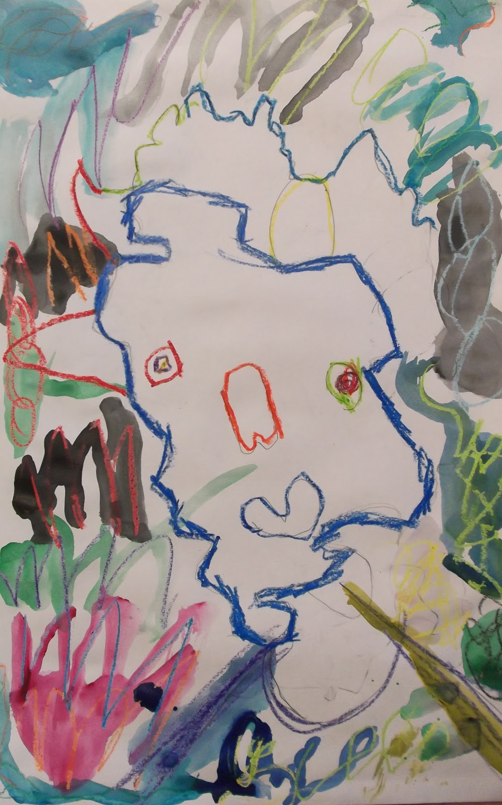
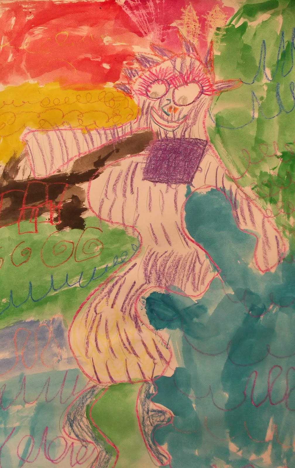
My first grade students were inspired by O'Keeffe's work and her large flower style.
My main goal was for students to create large flowers that defied the normal children's drawings and interpretation of a flower. Please do enjoy these oil pastel masterpieces.


Overlapping Shapes - First Grade


 In the California Standards for Art, the Second grade standards ask that you teach the theory of creating a work of art that exhibits the illusion of space.
In this lesson I wanted the first graders to get a feel of what they will be learning in future projects by using one of the most basic techniques in creating space in a work of art. 
Overlapping shapes allow the viewer to feel as if there are objects that go back further in the art, 
as opposed to flatly being placed next to each other. This lesson asks the students to use rulers to draw various shapes of their choosing, then draw other shapes overlapping over the original shapes. Students switch using the pencil and ruler to now erase part of the other shape to create an effect as if one shape is in front of the other.
The second stage to this project was to explore the world of oil pastels. Oil pastels are oneof the best ways to teach students how colors work. Once a child soaks up the information of how oil pastels mix, color theory is applied into the rest of their lives. 
I tried to focus on how students should use more than one color of oil pastel on top of each other, then use their fingers to blend the colors together.
Finally, students use watercolor resist technique to fill in the shapes. 

Be on the lookout for the result to this lesson in which the students will use texture painting to add a inter-weaving set of tree branches and transform this painting into a beautiful tree.


Monday, October 29, 2012

Pablo Picasso - Abstract Portraits Kindergarten


 Welcome to the Pablo Picasso section of this year's art program.
Pablo Picaso is a wonderful artist to study due to the story of how he became an artist and how he developed and changed art forever. I love to tell the students stories about how we enjoy abstract art now, but that there was a time when this type of art was misunderstood. Pablo Picasso had to create thousands of works of art to prove that his work was worth it and not just goofy child-like drawings. Artists like Pablo Picasso paved the way for contemporary and modern artists who created work from the early 1900's to today.
In this lesson I first spent roughly 10 minutes discussing the Picasso story and the significance of his work. I focused on Picasso's use of color and how the human figure was created using abstract methods rather than realistic. 
I compared the oval shape of a human head to the organic style of Pablo Picasso and instructed the students to create the form of the head using their entire arm movement, rather than locking their hand into the paper and forcing them to draw a smaller form. Once a head form is drawn, the students place the various parts of the face in unsuspecting different places around the original form.
 You can see how the students really experimented with using their expressive abilities to create abstract compositions.
Now that the sketch work was done, it was time to introduce theories behind color usage and the crayon and wax resist technqiue. I showed the class images of works of art that show the use of color to either express a mood or a focal point. We looked at how bright colors allow colors to pop out when they are on a dark background and vice versa and how artists use a balance of light and dark colors to help the viewer see the art piece better. In order to ensure the students would achieve a visually stunning work of art, students were instructed to:
1. Trace the form of the head using one color and to try and make sure that color is
made to look strong and opaque by tracing over the lines multiple times.
I really wanted to help the children develop a better sense of how to show strong lines by applying more pressure to the crayon than usual.
2. Treat the eyes as partners when coloring, so as to allow the viewer to know where they eyes are located
3. Use colors expressively to show a difference between the forteground portrait and the background
4. Feel free to add colors to the portrait that you wouldn't normally see in a real human portrait.
5. Last, the students added watercolor paint as a second layer of color to fill in the empty spaces.