Monday, October 29, 2012

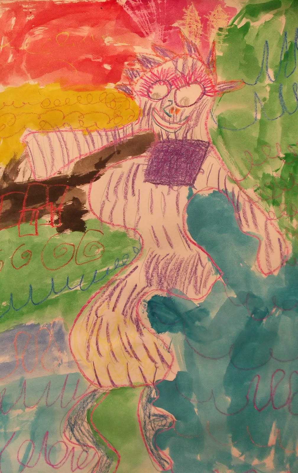
Pablo Picasso - Abstract Portraits Kindergarten


 Welcome to the Pablo Picasso section of this year's art program.
Pablo Picaso is a wonderful artist to study due to the story of how he became an artist and how he developed and changed art forever. I love to tell the students stories about how we enjoy abstract art now, but that there was a time when this type of art was misunderstood. Pablo Picasso had to create thousands of works of art to prove that his work was worth it and not just goofy child-like drawings. Artists like Pablo Picasso paved the way for contemporary and modern artists who created work from the early 1900's to today.
In this lesson I first spent roughly 10 minutes discussing the Picasso story and the significance of his work. I focused on Picasso's use of color and how the human figure was created using abstract methods rather than realistic. 
I compared the oval shape of a human head to the organic style of Pablo Picasso and instructed the students to create the form of the head using their entire arm movement, rather than locking their hand into the paper and forcing them to draw a smaller form. Once a head form is drawn, the students place the various parts of the face in unsuspecting different places around the original form.
 You can see how the students really experimented with using their expressive abilities to create abstract compositions.
Now that the sketch work was done, it was time to introduce theories behind color usage and the crayon and wax resist technqiue. I showed the class images of works of art that show the use of color to either express a mood or a focal point. We looked at how bright colors allow colors to pop out when they are on a dark background and vice versa and how artists use a balance of light and dark colors to help the viewer see the art piece better. In order to ensure the students would achieve a visually stunning work of art, students were instructed to:
1. Trace the form of the head using one color and to try and make sure that color is
made to look strong and opaque by tracing over the lines multiple times.
I really wanted to help the children develop a better sense of how to show strong lines by applying more pressure to the crayon than usual.
2. Treat the eyes as partners when coloring, so as to allow the viewer to know where they eyes are located
3. Use colors expressively to show a difference between the forteground portrait and the background
4. Feel free to add colors to the portrait that you wouldn't normally see in a real human portrait.
5. Last, the students added watercolor paint as a second layer of color to fill in the empty spaces.


Pablo Picasso - Abstract Portraits 2nd Grade


 Welcome to the Pablo Picasso section of this year's art program.
Pablo Picaso is a wonderful artist to study due to the story of how he became an artist and how he developed and changed art forever. I love to tell the students stories about how we enjoy abstract art now, but that there was a time when this type of art was misunderstood. Pablo Picasso had to create thousands of works of art to prove that his work was worth it and not just goofy child-like drawings. Artists like Pablo Picasso paved the way for contemporary and modern artists who created work from the early 1900's to today.
In this lesson I first spent roughly 10 minutes discussing the Picasso story and the significance of his work. I focused on Picasso's use of color and how the human figure was created using abstract methods rather than realistic. 
I compared the oval shape of a human head to the organic style of Pablo Picasso and instructed the students to create the form of the head using their entire arm movement, rather than locking their hand into the paper and forcing them to draw a smaller form. Once a head form is drawn, the students place the various parts of the face in unsuspecting different places around the original form.


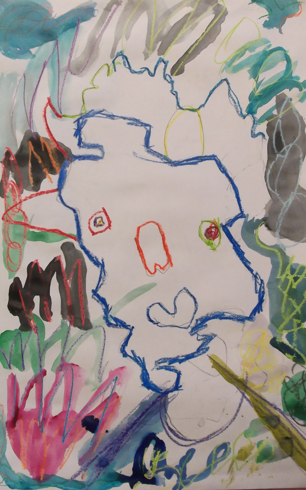
 You can see how the students really experimented with using their expressive abilities to create abstract compositions.
Now that the sketch work was done, it was time to introduce theories behind color usage and oil pastel drawing techniques. I showed the class images of works of art that show the use of color to either express a mood or a focal point. We looked at how bright colors allow colors to pop out when they are on a dark background and vice versa and how artists use a balance of light and dark colors to help the viewer see the art piece better. In order to ensure the students would achieve a visually stunning work of art, students were instructed to:
1. Trace the form of the head using one color and to try and make sure that color is
made to look strong and opaque by tracing over the lines multiple times.
2. Treat the eyes as partners when coloring, so as to allow the viewer to know where they eyes are located
3. Use colors expressively to show a difference between the forteground portrait and the background
4. Feel free to add colors to the portrait that you wouldn't normally see in a real human portrait.
5. Last, the students will use watercolor paint to add a second layer of color and fill in the empty spaces.


Wednesday, October 10, 2012

Rain Room Installation Defies Physics


Welcome to the rain room. 
If you have made your way to the Los Angeles County Museum of Art to experience any of 
their interactive art installations, you can see that there 
is a growing popularity in these types of installation pieces.
It is like a surreal rain shower in an office space – the rain comes from a '70s style panelled ceiling, but we are in the dark. In another way it is as if you were being ‘caught’ in the rain – not by the rain itself but by a huge spotlight shining at you in the darkness.
Designers Stuart Wood, Florian Ortkrass and Hannes Koch of Random International, a London-based collective, have used cameras to map the bodily movements of people within the shower, so the rain droplets stop falling wherever you are.
The idea that you can walk through a room-sized deluge without getting wet is like some kind of fantasy.
The Curve, Barbican, London EC2, until March 3. www.barbican.org.uk 
 
Here are some more images from the show that I was interested in. 
Love the use of negative space!


Wednesday, October 3, 2012

Los Angeles County Museum of Art LACMA - Sculpture 2000


The Los Angeles County Museum of Art (LACMA) presents  
Walter De Maria’s The 2000 Sculpture
a large-scale horizontal sculpture comprised of 2000 white polygonal shaped rods arranged in a herringbone patterned grid on the floor according to a meticulous logic. A pioneering figure in the development of minimal, conceptual, land art, and installation art, De Maria has made minimalist horizontal sculptures that occupy entire rooms since 1969.

LACMA Hours:
Mon, Tues, Thur,
11:00 am - 5:00 pm
Wednesday 
Closed
Fri
11:00 - 8:00 PM
Saturday, Sunday
11:00 - 7:00 pm

Admission is free for children under 18 and adults are free with a City of Los Angeles driver's license(Sorry Culver City and Santa Monica residents) after 5:00 pm on weekdays.

Here is a sneak preview of the exhibit.


Tuesday, October 2, 2012

Hello Kitty @ Known Gallery on Fairfax: One Day Pop Up Show

For those of you out there who are as fascinated with the phenomenon that is Hello Kitty,
you are going to be quite intrigued by this upcoming gallery show.
Featuring a large wall installation by the graffiti artist POSE and including new Hello Kitty themed work by the world famous street artist Shepard Fairey, all have been brought together to celebrate the release of the book "Hello Kitty: Hello Art". 

I am always looking forward to a good show at the Known Gallery on Fairfax Avenue, but this 
should be unlike any other. 
Please do note: One Day Pop Up Show only!

HELLO KITTY | HELLO ART!
October 14, 2012 | 1-6pm

Known Gallery
441 North Fairfax Avenue
Los Angeles, CA 90036


One on One Art Lessons - Realistic Illustration Drawing

Here are two drawings I taught to 5th grade students of mine. 
I feel it is imperative for young artists to be able to draw what they see in front of them 
first, before they really gain the necessary tools to draw using their imagination.
 I like to teach students how to be young illustrators who are handy with pencils, ruler and painting techniques that will travel with them throughout their lives.

The "Batman Building" in Nashville, Tennessee


Lamborghini Sport Car


Animal Pattern Paintings Preview


The California State Curriculum Standards for First Grade studies the life cycle as it pertains to animals, birds, mammals, reptiles and fish.
To help students gain a deeper understanding of the anatomy of these creatures, I demonstrated 
how to use shapes to build a drawing. One of the student's previous lessons was to draw 
people dancing using the shapes technique, so this new lesson was building on previous learned skills. My reasoning for showing students how to use the shapes technique is simple. At a young age I disregarded the techniques that comic book artists and professional illustrators and painters 
practiced building a drawing with soft, simple shapes, then adding detail to them and eraser unnecessary lines. 
This lesson takes approximately 3  sessions and incorporates various drawing, painting and printing methods. 
Session 1: Use the soft, pencil shapes technique to draw large animals on white drawing paper.
Session 2: Paint 2 different color patterns onto the interior or the form
One color the students should mix primary colors to make a secondary
Session 3: Use printing materials to stamp various designs on the painted patterns.

Extension: Ask the students to write something about their choice of creature.
 
Here are previews of my examples I demonstrated and a quick preview of 
the future photo post coming tomorrow night.